Brand identity, packaging
and product design
An identity and packaging system for tallow skincare, made in Northern Norway.
Talga Cosmetics · Brand identity, packaging, photography direction
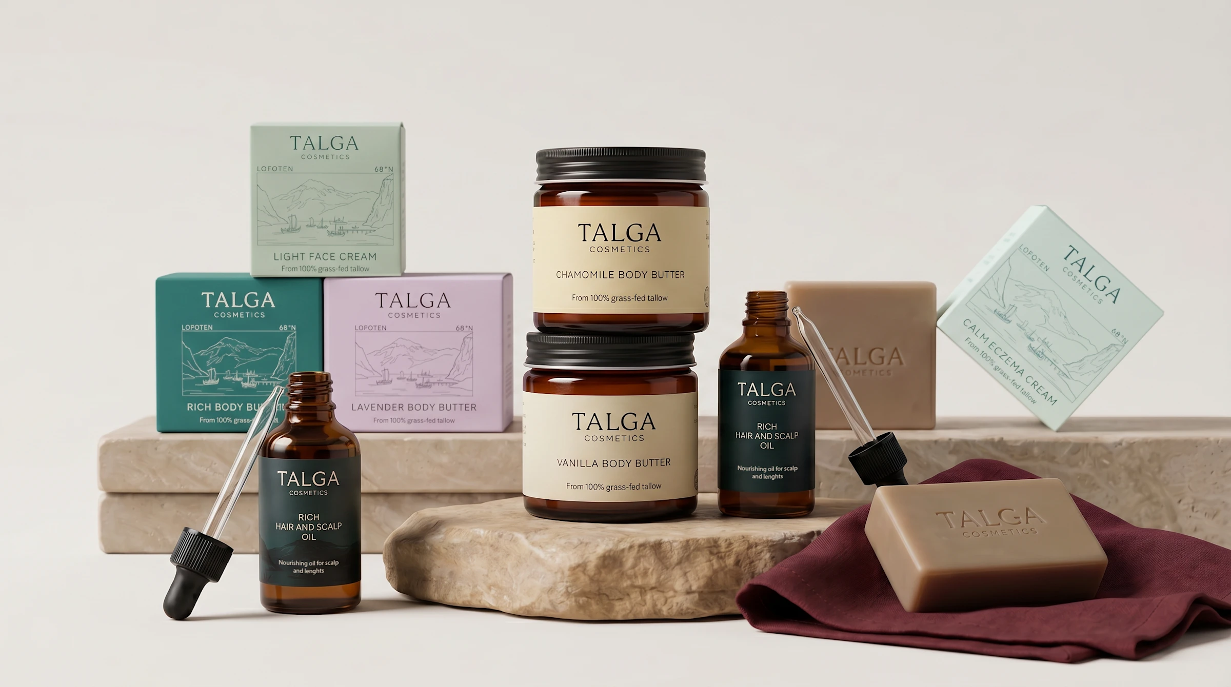
Talga is a family-run skincare brand from Northern Norway, built around grass-fed tallow and botanical oils.
The brief covered identity and packaging together: premium but grounded, closer to a small-batch producer than a beauty brand, and ready for products still to come.
The brief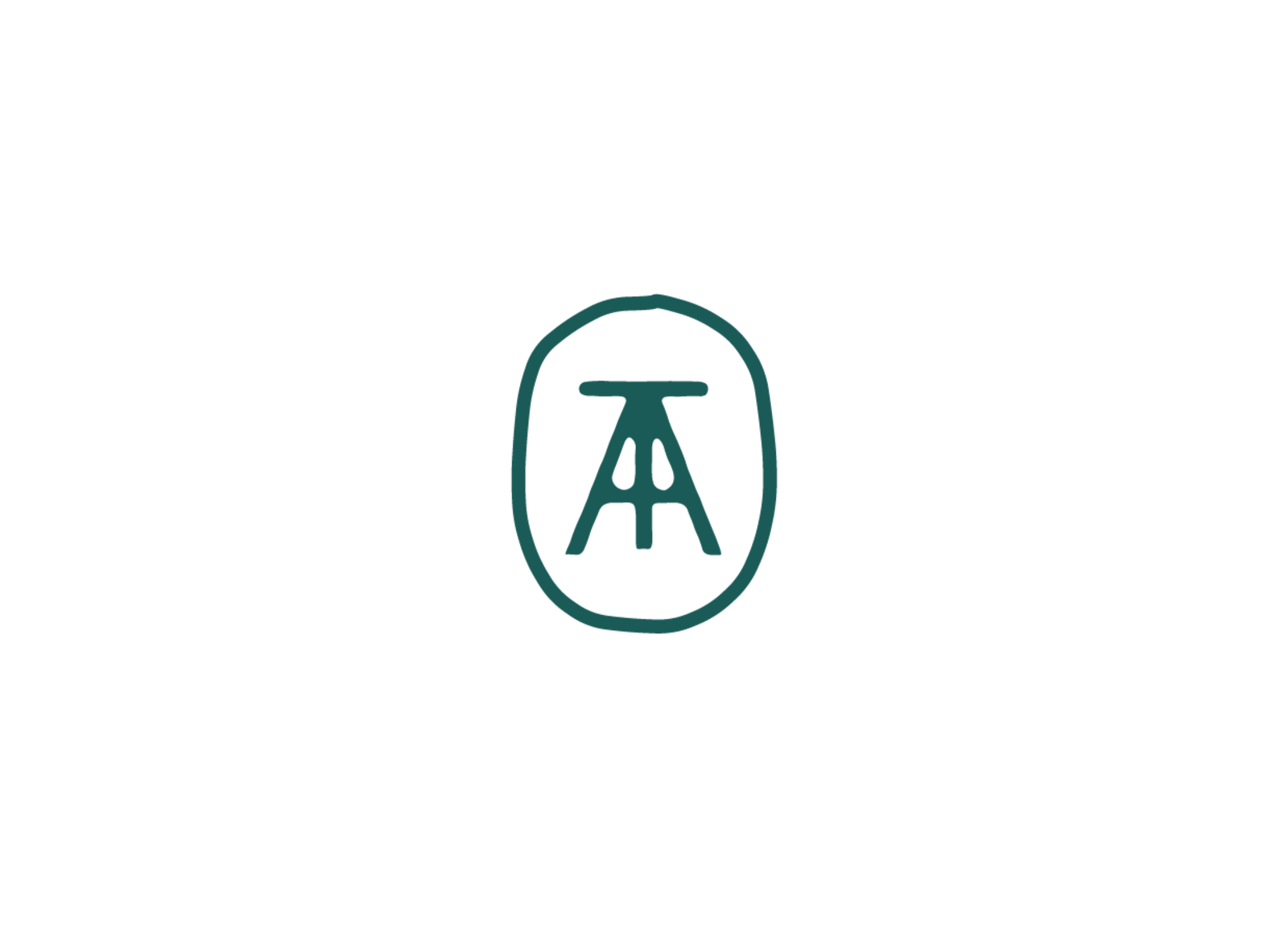
A T and an A, locked into the shape of a studio chair.
A maker's stamp rather than a logo. The colours come from the landscape: Fjord Teal anchors the family, Warm Cream replaces white, and every product gets its own tone.
Identity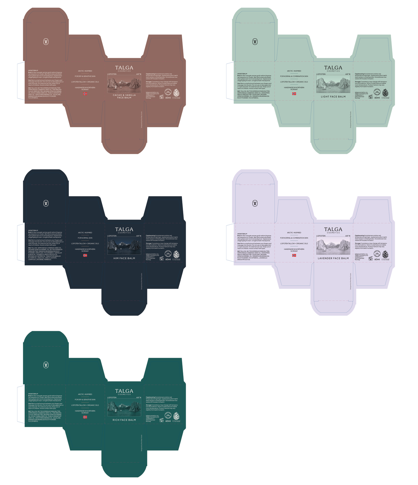
Lip balm packaging

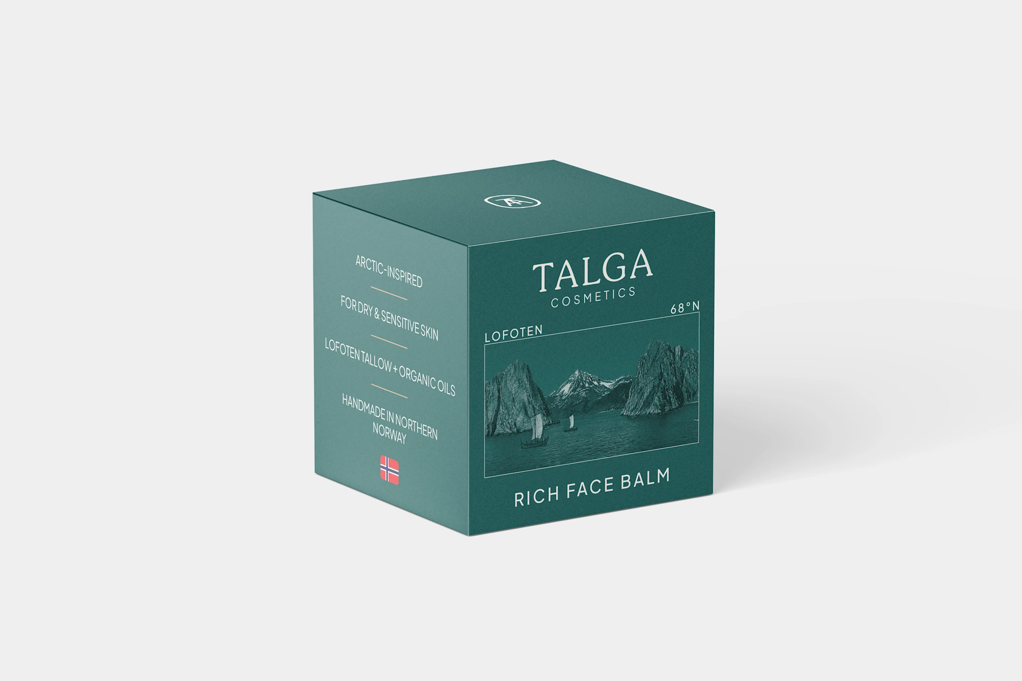
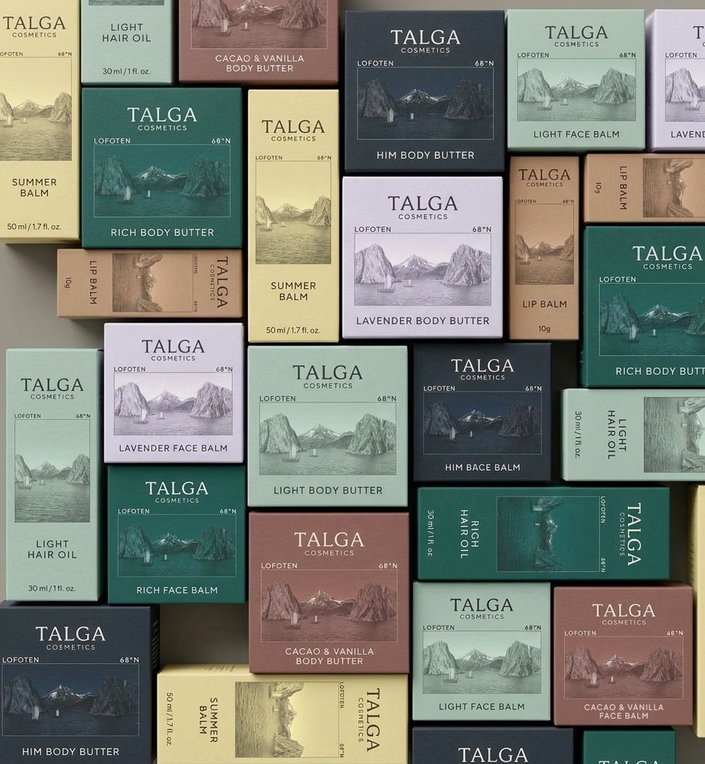
A postcard from the Arctic on every carton.
One layout across every size, so new products slot straight in. Each fjord image was adjusted by hand for its label colour, tying the product to the place its ingredients come from.
Packaging system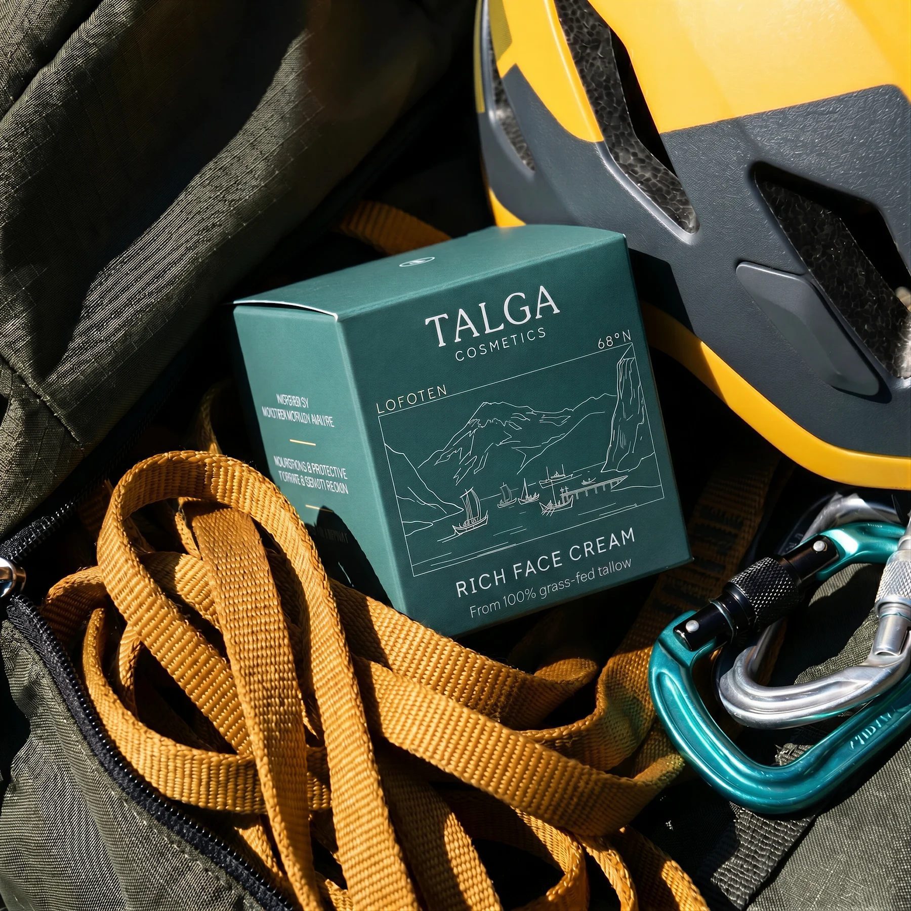
Designed for print, not just the screen.
Ink coverage checked image by image and prototypes assembled by hand. A coated finish, because skincare lives by the sink.
Production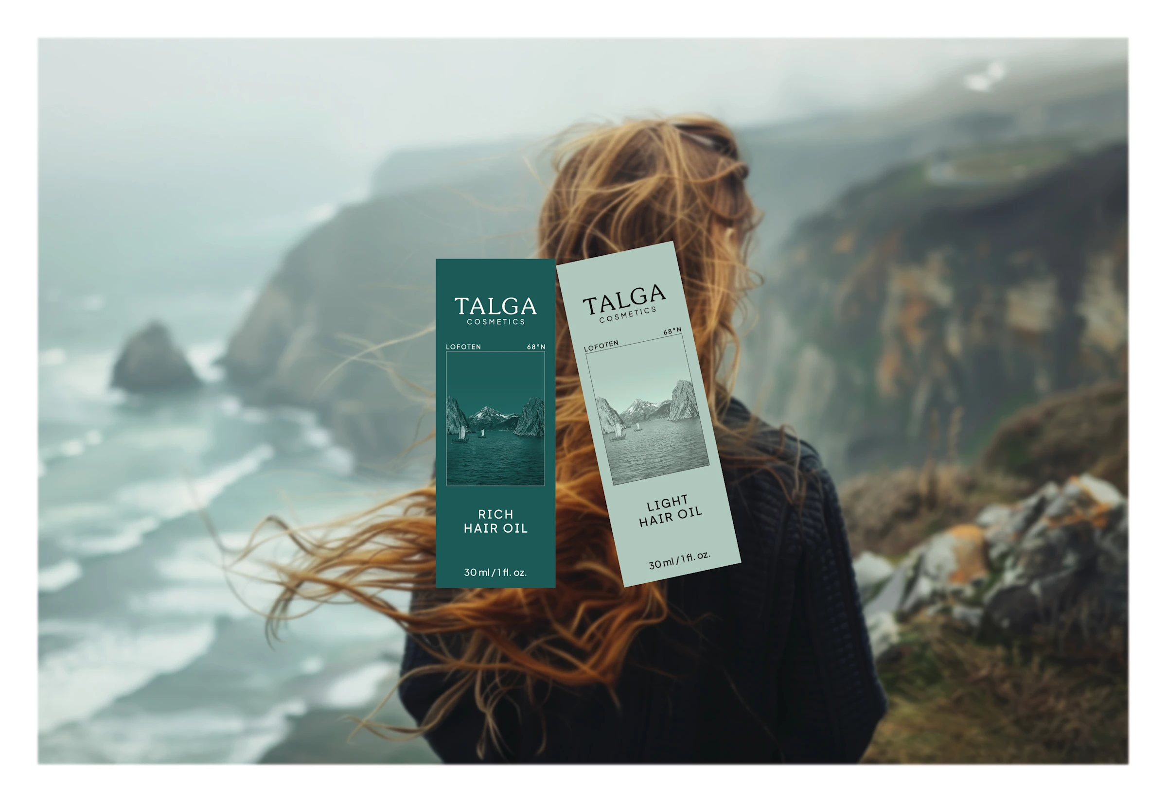
“Working with Nina has been a piece of cake from the very start until the final delivery. I cannot possibly express how much the final result exceeded my expectations.”
Sara Jakobsen, Talga CosmeticsWorking on something similar?
Start a conversation →